For this unit I completed the design safari activity. Most of this was done in my apartment, as I thought it would be fun to try to identify elements of design in a place that I am very familiar with. The picture below demonstrates the element of typography. In this sign, the word “welcome” is written in a pretty cursive font. I think this is a great design choice. It makes the sign seem more inviting and warm. I don’t think this sign would have the same effect if the font was plain letters.

The next picture represents the design element of rhythm. The placement of the pillows, as well as the placement of the prints hanging on the wall both represent rhythm. I think that the three prints on the wall have rhythm, with the two outer prints matching. The two pillows on the end of the couch both match, with a different pillow being in the middle. The rhythm seen in this image matches between the wall hangings and the pillows, which I think works well and is visually appealing.

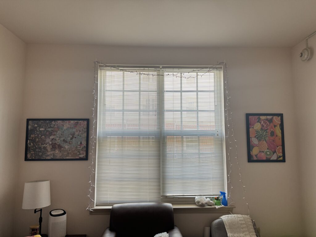
The next picture represents the design element of balance. This representation of balance is slightly asymmetric. Beside the windows there are two different wall hangings. One is very brightly colored and is hanging vertical, while the other side has a darker, horizontal print. I think this design choice works well. I think it wouldn’t look right if there was only something hanging on one side of the windows, so it balances with windows nicely to have things hanging on both sides.
The last picture represents the design element of use of space. There is a small corner in our apartment and we placed a small chair in that spot. It creates a nice addition to the room. Having another chair is great, as it offers more seating in the small room. There really isn’t anything else we could have placed in that spot, so the chair maximizes what we could have done with the corner.
